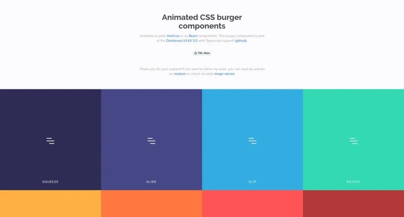
These burgers are available as plain html/css or as React components. This burger component is part of the Dashboard UI Kit 3.0.
Animated CSS burgers is a lightweight collection of animated hamburger menu icons available as plain HTML/CSS or individual React components.
The main features and integration options include:
Multiple Animation Styles: Offers distinct burger animation styles, including Squeeze, Slide, Slip, Rotate, and Arrow.
HTML/CSS & React Support: Can be used as plain HTML markup with lightweight CSS files or installed as individual modular npm packages (
@animated-burgers/{burger-style}) for React applications.Directional Variations: Supports animation directions (
left,right,up,down) for directional styles like arrow transitions.Flexible State & Element Wrapping: Toggles open states cleanly via an
openclass in HTML or anisOpenboolean prop in React, with support for custom wrapper components (e.g., rendering as a<button>element via theComponentprop).Font-Size Based Scaling: Scales fluidly using
emunits based onfont-size(with a baseline of 12px), making size adjustments as simple as changing the element's font size.Custom Color Overrides: Allows developers to easily change line colors by targeting
.burger-linesand its pseudo-elements (:beforeand:after) in CSS.

You may also be interested in ...

Animxyz

Arrow JS