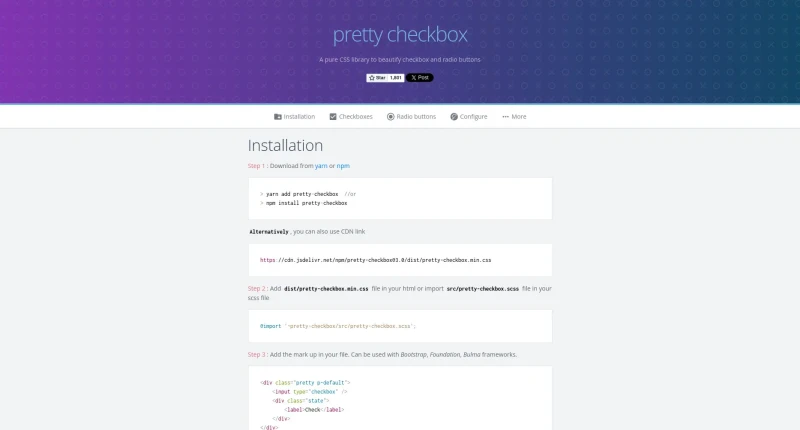
A pure CSS library to beautify checkbox and radio buttons.
Pretty checkbox is a pure CSS library created by Lokesh that beautifies standard HTML checkbox and radio button elements without requiring JavaScript.
The main features and customization capabilities of Pretty checkbox include:
Shapes & Style Variations: Offers multiple base shapes—including default Square, Curve (
p-curve), Round (p-round), and iOS-style Switch (p-switch)—paired with Fill (p-fill), Thick (p-thick), Outline, and borderless Plain (p-plain) styling variants.Color Palette Options: Supports solid color themes (
p-primary,p-success,p-info,p-warning,p-danger) as well as matching outline color variants (p-primary-o,p-success-o, etc.).Icon, SVG & Image Support: Replaces standard input controls with custom font icons (
p-icon), inline vector paths or SVG files (p-svg), or auto-resized image graphics (p-image). It is pre-tested with popular icon libraries such as Font Awesome, Material Design Icons, Glyphicons, Typicons, Ion Icons, Feather, and UIKit.Built-In CSS Animations: Enhances user interactions with CSS keyframe animations, including Smooth (
p-smooth), Jelly (p-jelly), Tada (p-tada), Rotate (p-rotate), and Pulse (p-pulse).Toggles & Interactive States: Includes dual-state toggle switches (
p-togglewithp-onandp-offlabels) alongside native and custom input states like hover (p-has-hover), focus (p-has-focus), indeterminate (p-has-indeterminate), disabled, and locked (p-locked).Framework Compatibility & Modular SCSS: Integrates cleanly with major UI frameworks (Bootstrap, Foundation, Bulma), provides dedicated plugins for Vue (
pretty-checkbox-vue) and Angular (ngx-pretty-checkbox), scales dynamically via font-size orp-bigger, and allows deep SCSS variable customization.Installation & Licensing: Available via npm, yarn, or CDN link (
pretty-checkbox.min.css), and distributed open-source under the MIT License.
You may also be interested in ...

Vidstack
Slick