
Storybook is the most popular UI component development tool for React, Vue, and Angular. It helps you develop and design UI components outside your app in an isolated environment.
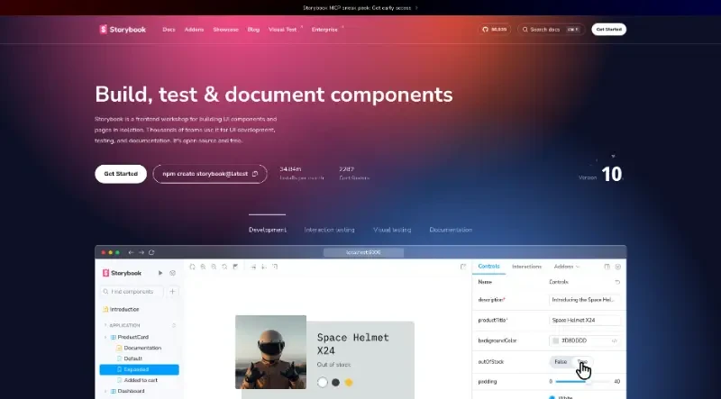
Storybook is a free, open-source frontend workshop specifically designed for building, testing, and documenting user interface (UI) components and pages in isolation. It is widely used by engineering teams to streamline UI development without the distractions of complex business logic or external APIs.
The main features of this tool include:
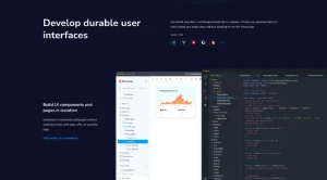
Isolated Component Development: Storybook allows developers to implement UI components and full screens without needing to run the entire application. This isolation makes it possible to focus on the UI without fussing over data, APIs, or business logic.
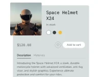
The Power of "Stories": Users can capture "known good" states of components as Stories. These stories allow developers to mock and revisit hard-to-reach edge cases and specific UI states (such as "added to cart" or "out of stock") that are otherwise tricky to reproduce within a live app.
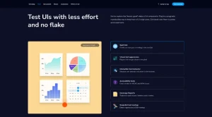
Automated Testing and QA: The tool uses stories to power automated tests, helping teams verify UIs with less effort and reduced "flake". It serves as a pragmatic way to keep track of UI edge cases throughout development and QA.
Centralized Documentation: Storybook acts as a single source of truth by bringing UI, live examples, and technical documentation together in one place. This helps teams adopt existing UI patterns and integrate documentation directly into their design systems.
Collaboration and Stakeholder Alignment: Developers can publish Storybook as a website, allowing stakeholders to review and sign off on UI work without touching any code. It ensures everyone stays aligned on what is currently in production by showing how the UI actually works rather than relying on static designs.
Seamless Integration and Automation: The platform integrates with over 400 industry-standard tools and supports major frameworks like React, Vue, Angular, and HTML. It can also be added as a CI (Continuous Integration) step to automate UI development workflows and ship faster.
Interoperability: Stories are built using the oEmbed standard, allowing them to be embedded directly into wikis, Markdown files, and design tools like Figma.
You may also be interested in ...
AntDesign

AgnosticUI