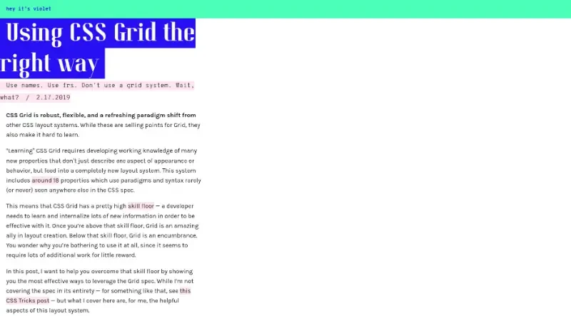
CSS Grid is robust, flexible, and a refreshing paradigm shift from other CSS layout systems. While these are selling points for Grid, they also make it hard to learn ... Post written by Violet.
CSS Grid is a robust and flexible web layout system that represents a paradigm shift from previous CSS methods, offering precise design control while simplifying code.
The main features and best practices for this tool include:
Use Names Instead of Numbers: It is recommended to name grid areas (e.g.,
sidebar,main) rather than referring to columns and rows by numbers. This significantly improves readability and makes the code future-proof, as it allows you to swap visual orders without touching the underlying content.The Fractional Unit (
fr): This unit allows you to distribute available space based on fractions. It delegates complex arithmetic to the browser's layout engine, preventing manual math errors and issues associated with percentages.Reducing Code "Noise": Rather than literally replicating a designer's 14-column system, it is better to only define the columns actually being used. This makes the code less noisy and more reflective of its actual use.
Independent Nested Grids: Since CSS Grid does not have a concept of inheritance, you should create micro-grids within content elements for local alignments. This keeps elements simple and internally consistent without needing to know about the top-level grid.
Separation of Content and Presentation: The system allows for cleaner, flatter HTML because you do not need to add unnecessary "wrapper" divs just to make the styling behave correctly.
High Skill Floor: Effective use requires learning approximately 18 new properties and internalizing a completely new layout paradigm, which can be difficult initially but offers great rewards once mastered.
You may also be interested in ...
CSS Layout Generator
Hexagonal Grids
CSS Grid videos tutorial