Find Your Dream Remote Job. Search 100,000+ work from home jobs at top remote companies. Loved by 10,000+ remote workers

Ship your startup in days, not weeks. Shipfast is a NextJS boilerplate with all you need to build your SaaS, AI tool, or any other web app and make your first $ online fast.
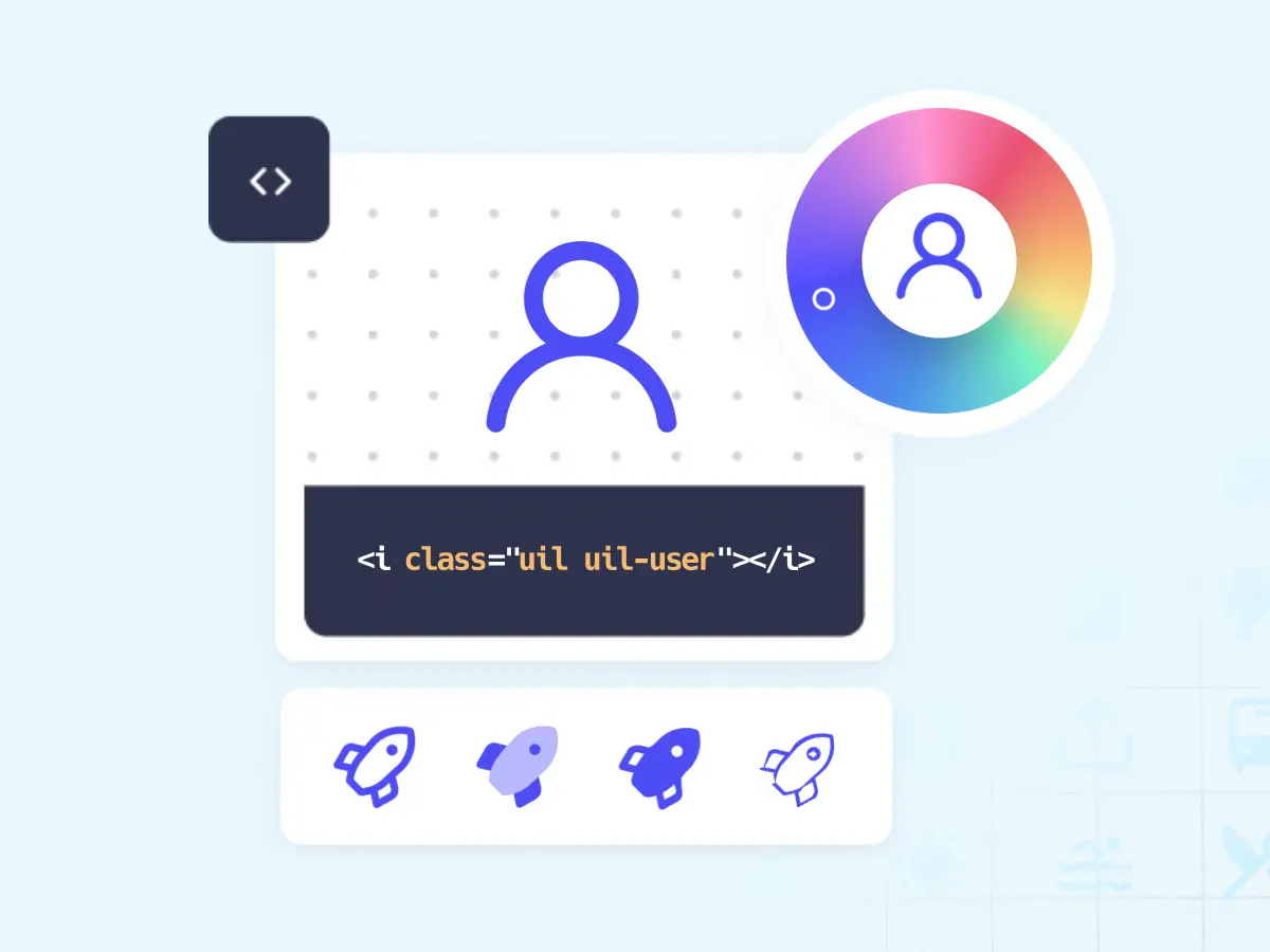
1300+ Pixel-perfect vector icons and Iconfont for your next project.
Assets for building high-quality, consistent user experiences at Thumbtack.
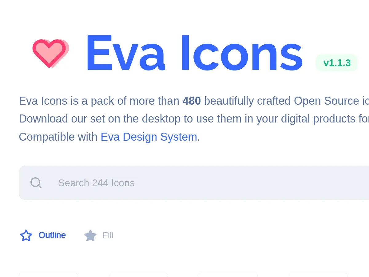
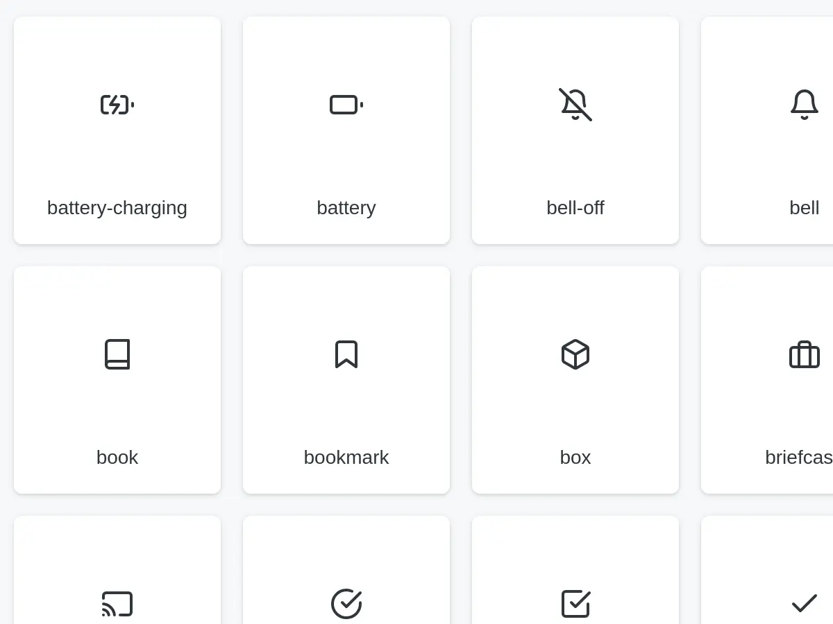
Eva Icons is a pack of more than 480 beautifully crafted Open Source icons for common actions and items.
Download our set on the desktop to use them in your digital products for Web, iOS and Android.

Native Linux App for UI and UX Design built in Vala and GTK.
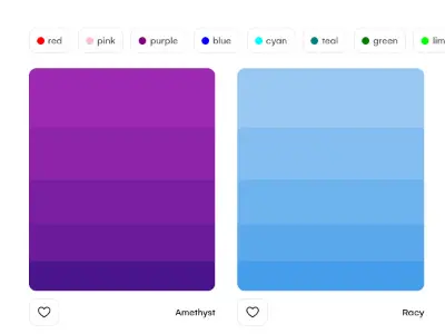
Colors that work together are curated and fashioned into quality palettes that you can incorporate. No more racking your brain to find the right color combinations!
Simply beautiful open source icons designed by Cole Bemis.
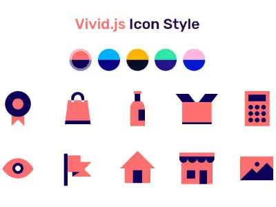
Vivid is a JavaScript library which is built to easily customize and use the SVG Icons with a blaze.
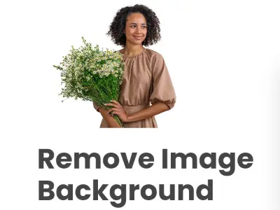
Remove.bg is a free service to remove the background of any photo. It works 100% automatically: You don't have to manually select the background/foreground layers to separate them - just select your image and instantly download the result image with the background removed!
Do you need inspiration for your next newsletter webdesign? Check this Email newsletter gallery.
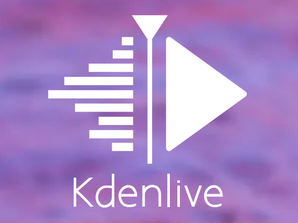
Kdenlive is an acronym for “KDE Non-Linear Video Editor.” It runs on Linux, Windows, macOS, and BSD.
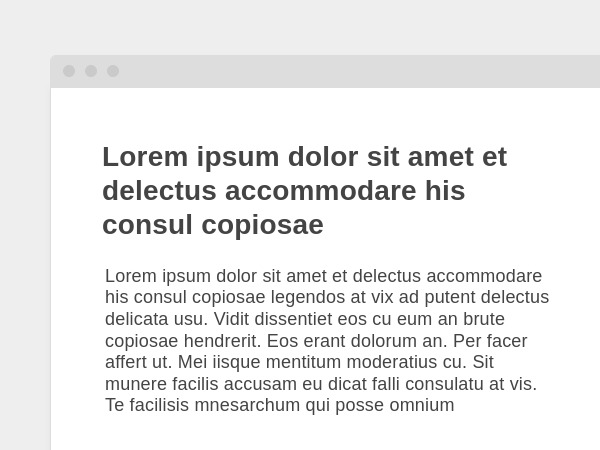
A better online wireframing experience.
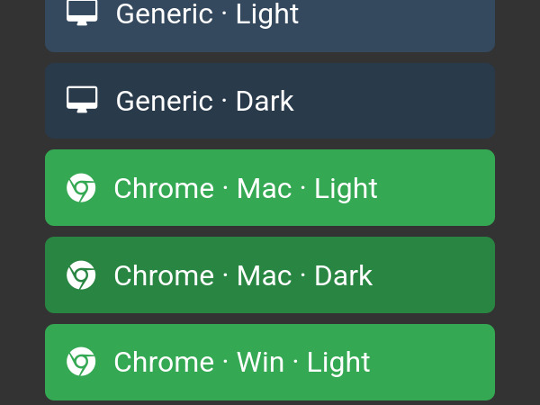
The easiest way to wrap screenshots in browser frames. Supports multiple browsers, operating systems, and themes.
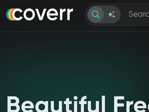
Coverr is a free stock videos for commercial and non-commercial use, no attribution required. It's like Unsplash but for videos. Just use the search engine and pick-up a nice video for your next website project.
Picular is a colors search engine. Enter words in the search field, Picular will suggest corresponding colors.


